When I started amPR inc. in April 2023, my only concern was speed to market. I needed a name, I needed a logo, and I needed a website. In reality, it’s possible I could have launched without any of those things but the trust that comes from a brand is important and I knew I wanted to feel “legit”.
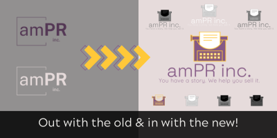
I built my amPR logo haphazardly in Canva, 14 weeks pregnant, emotional, and newly laid off.
It worked. It was an OK fit, with the visual intending to demonstrate a bit of “out of the box” thinking, which is the approach we take to PR and marketing. But mostly, it never felt quite right. I took the stance on that logo that I take with my kids doing tasks: It doesn’t have to be perfect, but it has to be done.
At the same time, I all but slapped my website together. I used a template, almost exclusively used stock imagery, but I painstakingly went over my copy again and again until it felt right.
And, unlike the approach I take with my clients, I leaned into “set it and forget it” mode. It wasn’t bad, therefore, it would be good enough.
For then.
In late November, I quietly relaunched my website. (Maybe you noticed! Maybe you didn’t.)
I killed my cookie-cutter, boring website. Accidentally, as it were – I crashed it, lol – and then needed to completely rebuild it on a new platform for it to have the capabilities I wanted for this year. So, while recovering from surgery, I set to work at creating the new ampr.co – more colourful, and much, MUCH more me.

Behind the Logo & Branding
There’s obviously nothing novel about a typewriter as the logo or icon associated with a writer. But, there’s actually a little bit more to it than that.
I *always* wanted a typewriter. Always. I would regularly look at them at antiques shops and drool. Are they practical? No. But there’s always been something about the sound of the clack-clack of keys and the romance of typing on a typewriter that’s gotten me. I remember playing with typewriters as a child, when I first fell in love with writing and storytelling. There’s a nostalgia I can’t quite describe.
The year we bought our first home, my partner and son gave me a vintage Olympia SM4 typewriter with cursive typeface, complete with its carrying case. It became my most prized possession. When I first set up my home office, it was proudly displayed and always had paper next to it – which I would load up and jot down notes from time to time, just because I could.
I knew I needed to incorporate my typewriter into my logo.

While the appearance of my website and the logo have changed, my brand colours actually haven’t. I’m just using them more! Individually, I wasn’t sure if they totally worked but the more I played around with them, the more I loved it.
Anyone who knows me knows that yellow is my most favourite colour – it’s also the colour of our home’s front door (which I was THRILLED about).
Yellow has always felt a bit bold and fun, which is how I like to approach my work. Fun fact: My bedroom at my parents’ home was bright yellow for Y E A R S, and it’s one of my favourites to wear, too!
I chose purple because it’s always felt like a creative but elegant shade to me. And, perhaps shockingly, it’s not a colour I’ve ever gravitated towards.
The blush, grey, and off-white tones are subdued and help the darker shades show up. That’s precisely how I operate with my clients – I want to complement them and make sure THEY shine.

Is my branding going to win any awards? Not likely. But, for the first time in almost two years, my brand is really beginning to feel like a true reflection of me, how I work, and where we’re going.
Stay tuned…


